 |
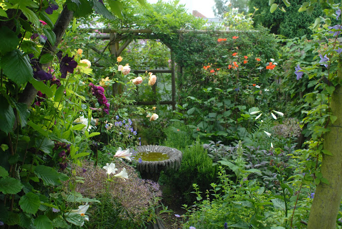
| Old oak pergola, clematis Etoile Violet in foreground |
I took advantage of a few spare hours of reasonable weather last weekend to visit Old Thatch, near Bourne End www.oldthatchgardens.co.uk It is always good to refresh ones ideas and enthusiasm by looking at inspirational gardens and Old Thatch was as exciting on my second visit as my first, four years ago.
 |
| Pergola with dominant cerise rose American Pillar |
 |
View from pergola (turning round from picture above) - spacious and restful on the eye
|
Surrounding a beautiful thatched cottage garden designer Jacky Hawththorne has created a series of gardens rooms which link and complement one another elegantly. I was most envious of the space the old oak pergola allows for growing clematis and roses in a luscious combination. From Jacky I realised the reason my clematis aren't doing as well as they might is because I am not feeding them enough - they feed theirs with liquid feed every 3 weeks. Right - so it will be then!
Two other things struck me as powerful: firstly how Jacky uses very sharp contrasting hints in harmonising colour drifts. In the front garden I loved the use of red lychnis among the pinks and whites but I am never going to be a lover of yellow in my own garden - even thought it works well at Old Thatch.
 |
| Drifts of cottage garden plants with sharp red notes of lychnis |
The second planting feature which impressed me is the use of strongly contrasting dark red against very light coloured foliage - as in the images following.
Last but not least the garden incorporates elements of fun (The Pencil Garden for kids) and surprise elements like this trompe l'oeil window in the wood pile!
 |
| "Things are not always as they appear to be..." |


No comments:
Post a Comment